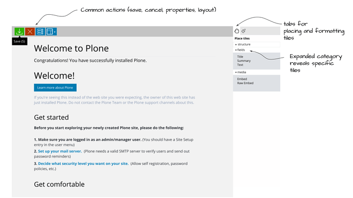
New Mosaic Experience (Mockup)

This is incomplete but still indicative of the direction I'd like to see Mosaic 3.0 move towards. Putting it out there in case it inspires someone.

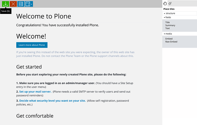
I especially like that the right sidebar with available custom tiles displaces the full width of the site, similar to the way the edit bar does on the left in standard Plone.
I've added some additional annotations below to help to explain my ideas:

The mockup file is available here:
https://www.figma.com/file/SbY9W15wyN813Saa3ZR46QJA/Mosaic-Future?node-id=3%3A43

1 Like

@datakurre
really should have raised this with you at the conference, any thoughts on this ^^^?

Mixed feelings.

Tabs look good because the modality (you either only place tiles or style tiles/rows at the same time).

Separate column for tabs could break WYSIWYG with layouts and probably cause issues with themes.

But in general, before putting too much effort into refactoring the UI, I'd prefer to wait, how "Medium like" editor works in Pastanaga MVP, and how layout editing would work with that.

1 Like

Given there is no documentation on this or release date, why are we waiting?

I can't believe you're asking this seriously. But in case you are, the people doing the work continue to sprint on it but also have to do their paid work...

I am seriously asking. The idea of mosaic was proposed by limi in ... I'm going to say 10 years ago? I'd have to look it up. We have something mostly implimented but everytime something is proposed the idea that its been written in jquery and there is X new framework or Y new UI effort underway has delayed it. So we wait and wait.

GitHub - plone/pastanaga: Pastanaga UI for the Plone CMS <- no documentation. No description of what problems its solving. No rationale. The only documentation about it has been at conferences and sprints so hasn't gone out to the wider community for discussion so it's hard to gauge if its going to create more problems that it fixes. But what I do hear is, oh lets wait and see. Let's not fix mosaic.

Seriously, what problems does it solve or is it yet another effort to play with new frameworks that leave plone in a state of doing not quiet everything it did before for marginal gain? And if anyone uses the words "modern javascript to attract javascript developers"... well you know what they say about those who don't learn from history...

If it does fix genuine problems, then how do we help?

Ok. I was wrong. It will be 10 years in april next year. http://limi.net/articles/simplifying-plone/

I recommend anyone to reread this post. Not only is still very close to what we should have already in plone core, but it explains clearly the rationale and problems its trying to fix. April 2008!

Make sure you watch the videos

I'll repost the conclusiion here

In the articles Simplifying the content authoring experience, Improved handling of rich media and Composite pages, listings and content proxies, we have laid out an approach to radically simplify the content authoring experience in Plone.
We have in one fell swoop eliminated the need for:

  • Collections as a separate type,
  • Images as a separate type,
  • Composite page types,
  • Proxy (represent one object in two locations) type,
  • Default pages,
  • The need for a separate "Contents" tab,
  • Folder as a separate type.

We have made it substantially easier to handle:

  • Rich (“opaque”) media like video, audio and Flash,
  • Content reuse, i.e. generating new content by reusing other content (example: book with 3 different audiences),
  • Application-specific functionality like forms/polls/maps inside a page.
    We have made it possible to:
    Share “snippets of Plone” (widgets) to other systems — blogs, iGoogle, Facebook — you name it.

…all while making the UI massively simpler and easier to work with.

And if that wasn’t enough, the infrastructure improvements can be done gradually over a number of small releases in the 3.x series, and then culminate in a Plone 4.0 or 5.0 where we make the entire picture come together in a coherent new user experience. And we mostly don’t need to invent new infrastructure, instead we can build on work done in the Plone 3.x releases.
july 8th, 2008, Alex Limi @limi

There are some great quotes form 2010.

"Coming up in Plone 5 is the Deco/Tiles system for content editing, this is going to be really pretty amazing" answered Oct 13 '10 at 19:30 Matt Hamilton.

"Deco finally!" - 2012 - https://www.youtube.com/watch?v=CCzJiD76iqs

So why are we waiting again?

1 Like

The missing link in this conversation is some of what was presented at the conference. Also there was a recent pastanaga sprint. It boils down to this, are there persons in the community willing to put in the energy to get the next Mosaic experience out the door?
It could be that pastanaga might be used to implement the next experience. I think that @datakurre has his finger on the pulse of development in the community so I don't mind following his intuitions on this.

Two questions...
How long is reasonable to wait for the "Medium-like" editor?
@datakurre If this becomes a GSOC 2018 project would that change your perspective on "playing" with a new UI?

exactly, we've been putting technology first over the past 6 years and that has been a big failure.

that's why I've been asking for a real roadmap updating the one we currently have.

At first, for me it seems that your original mockup in the beginning of this thread could be implemented mostly with rewriting the current Mosaic editor CSS. Keeping that scope (only CSS or possibly some touches for Mosaic toolbar initialization JS) would make it good fit for GSOC. /cc @cewing

My only concern about your mockup was that formatting toolbar was positioned right of the main layout. (We have had some issues with the left sided Plone toolbar, because might cause different flow of content for logged-in and anonymous users because of different content are width.)

Beyond that, to be honest, I dont' feel like having my finger on our current pulse :slight_smile: Rant time...

If Mosaic Editor already works for you (in general), there is no need to wait for React, Pastanaga, or anything else. Just write down your issues and figure out the resources to fix them. I have the current Mosaic in production (well, a branch "datakurre-custom" of it with some enhancements) and I try to find time to fix the worst bugs in it as we encounter them (unless it's easier to teach workarounds).

But I'm also very frustrated with the current editor code base. This year's GSOC was a good example about it. Mikko managed to build proof of concepts of a couple of new features for the editor, but because of the fragility of the code base, nobody seems to have resources merge the code (without causing unexpected amount of regression).

I liked the original version of the editor: It had everything in the top toolbar only. Between left buttons and right dropdowns there was area for selected tile dependent "favorite actions", including rich text formating actions for rich text tiles. There was no TinyMCE toolbar. Only Mosaic toolbar and tile type dependent formatting actions. While that had less visible features than the current full-blown floating TinyMCE toolbar by default, it was simpler and more consistent experience.

I also feel that TinyMCE keeps Mosaic as hostage. I do like that TinyMCE can manage editors pasting their contents from Word. But it's also the biggest single reason, why the current Mosaic Editor codebase is as messy as it is. (And I still recall reading about bugs like TinyMCE toolbar sometimes disappearing, TinyMCE toolbar or its menus not properly floating on long pages, etc...). Yet, as long as you want TinyMCE the current editor is the only option. There is no TinyMCE in plone-react.

Not to mention missing i18n or a11y features...
1 Like

(sorry for the tangential) I can write you 3k different roadmaps, would that matter? not much as long as nobody designs/implements/tests/documents it. Aside from the broad picture (Zope 4, python 3, something else??) there is an open field of what companies/individuals are working on that other can benefit from it (REST API, pastanaga, angular and react kits, ...).

The real question, regarding roadmaps, would be to ask companies around Plone, what are their priorities and which parts of them can be retrofit to Plone, that's the only thing we can be sure that can be on a next release (be it micro, minor or major). Anything else (porting to PHP!) is moot unless someone takes it or drummes it enough until someone else picks and does the work. As sad and as true as that.

yes, and this is exactly what's missing in the process: nobody has asked anything; developers can just go to the repos and mess around to achieve their own goals without further discussion if that is desirable for the rest of us, besides some framework team members.

I have to admit this is now better than before, but is far from optimal, and if you're not following 7x24 the GitHub activity feed you maybe be too late to react to some of these changes; that's why I spend time on this every morning.

seems to me that strategic planing sprints still are discussion on technology and not features, and if you don't believe me take a look at the current roadmap.

(sorry for hijacking the thread, again :wink: )

This is an important consideration. I will need to reflect on my recent projects to see whether we are dependent on TinyMCE. Maybe after I break everything down I'll discover that Mosaic is emerging as more important than TinyMCE, but I don't know yet.

What I can say is that Mosaic, while not perfect, aligns more closely with how persons expect to do modern page layout.

TinyMCE plus accessibility and internationalisation are very important concerns in moving forward.

(without knowing anything about the 'real problem')
Would it be possible to use a text area and class="pat-tinymce" and 'remove all TinyMCE stuff from Mosaic ?

It seems to me that the discussions we've had in Sorrento and Barcelona this year illuminated quite well why we agreed on a general roadmap, which does contain user features and is not just "technology" (not that there's anything wrong with a technology focus, seeing as Python 2 end of life is a very real danger). Dylan seems to fall back consistently on wanting everything documented so that he can understand it, but honestly we don't have the time to do that and to convince Dylan that what we are doing makes sense (it does to us).

Mosaic works quite nicely :slight_smile: I hope no one comes away from this thread thinking that isn't the case. As we all have time and the need to make improvements to it (and to Plone generally) I'm sure we will continue to do so. The discussion about the roadmap is always ALWAYS open to new or improved ideas but as always it's not just a matter of arguing but also of doing or of convincing someone to do what you are arguing for.

1 Like

No. We already use the mockup pattern code to make Mosaic TinyMCE respect Plone configuration (with the exception if still allowing tile specific TinyMCE toolbar configuration). A single big issue is that any DOM change near TinyMCE instance freezes it, and Mosaic has to kill and relaunch TinyMCE editors all the time. Also a lot of extra code is needed for making the toolbar float on longer than viewport tiles. And the there are quite amount of special cases.

Sure it’s not all thst bad: we have had Mosaic pags with >= 100 TinyMCE editor instances on edit mode and it still runs :slight_smile: (Yet, loading time for that edit page is an another issue - initializing those editor should be made lazy).

Actually, it is pretty amazing compared to 'anything' (even Wordpress stuff).

If it is fragile with 100+ tiles, I would say that is not a big 'weakness'.
What else is there that can make so complex pages with so little work?

If things gets too slow, it is very straightforward to just (lazy) load content with javascript (for example pat-inject or pat-contentload)

I don't think Wordpress is the benchmark on page layout solutions.
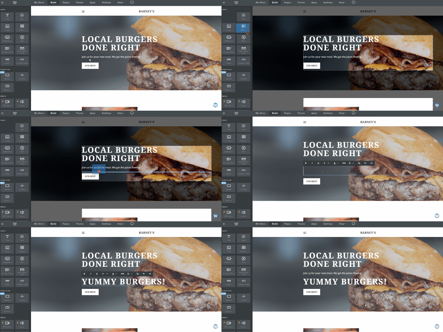
We need to look at services like, Weebly, Webflow, Wix and the new Google Sites.
Helps to keep my feet on the ground when I think that Weebly has been doing drag and drop page layout for easily a decade.
weebly-adding-text

This is the baseline. The open source CMSes are generally, way behind on cohesive UX around drag and drop page layout solutions. I haven't done a thorough survey but, from what I see, Wordpress relies on various, non-inter-operable plugins to pull it off, the other one I know of is Odoo Website Builder which looks pretty good.

To my 'taste', this is 'too easy'. This is what you need if you make the site once and never touches it again… "
Remember when we dreamt of 'inline editing' ?
… it was not there for long (?), it was easy to change things by accident.

Anyway: This kind of 'drag and drop' will probably never happen, I would say this is what we should try to have:

  1. Some themes that looks good
  2. I think the themes should include some demo content for 'new users' (experienced users can choose another install-profile')
  3. Easy way of selecting 'top-navigation' (hamburger menu, logo to the left, contact info on top etc)
  4. Some way of customizing the theme (Mosaic is the the way)
  5. Descriptions on how to edit / customize the theme. Should include 'how to save new layouts', customize them, and make one default view for a content type.
    These descriptions should be in the Phone site itself, either explaining or linking directly to the documentation.

With my current idea which I have spent some weeks on ( collecive. mulitheme) , I try to do 1,2 and 4 (but I need to make a living soon..... ) by making a lot more then you need. Then the user can:

  1. Override the theme (by coping it in the theming control panel)
  2. Delete all the stuff they do not need.

PS: If it should be of any interest to anyone, I just made some 'portlet fragments', so one can include portlets in full view mosaic layout: http://xweb14d.plana.dk:8081/Plone/fragments/portlets-fragment

I think "too easy" is a good thing, they've been able to attract over 40 million users as a result. One thing I'd love to see is "unattended" on-boarding for Plone. I don't think the pieces of Plone (or Wordpress for that matter) are easy enough for "unattended" on-boarding. Having an intuitive editor like this would lower the barrier to getting started.

You should try out Weebly to better understand and compare the experience. When I use Weebly, I imagine their page editor running on top of Plone :heart_eyes:.