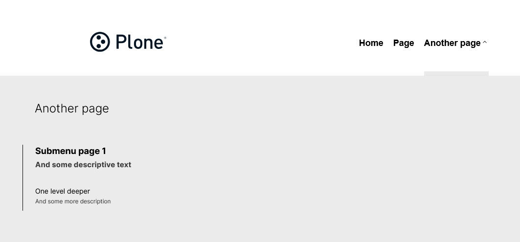
I played around with the Volto Light Theme fat menu on a test site and wanted to share a few improvements. These are all contained in a single shadowed component, so they're easy to drop into your own project.
What changed
The default VLT fat menu opens for every top-level navigation item, even standalone pages with no children. We wanted it to only open when there are actually sub-pages to show — and for standalone items to just navigate directly on click.
We also wanted subitem descriptions to appear in the fat menu panel, pulling from each page's standard Plone summary field. No backend changes needed — the description field is already returned by the navigation API.
Both fat-menu items and standalone items render as <button> elements so hover styling is uniform across the nav. A chevron indicator shows which items have a submenu.
How to use it
Shadow @kitconcept/volto-light-theme/components/Navigation/Navigation.jsx in your addon and replace it with the file below. Then add the SCSS to your addon's _main.scss.
You can control how many levels deep descriptions appear by changing this constant at the top of the file:
// 0 = all levels, 1 = first level only, 2 = first two levels, etc.
const DESCRIPTION_DEPTH_LIMIT = 0;
Navigation.jsx
// SemanticUI-free pre-@plone/components
import React, { useState, useEffect, useRef } from 'react';
import PropTypes from 'prop-types';
import isEmpty from 'lodash/isEmpty';
import { useDispatch, useSelector, shallowEqual } from 'react-redux';
import { NavLink, useHistory } from 'react-router-dom';
import doesNodeContainClick from '@kitconcept/volto-light-theme/helpers/doesNodeContainClick';
import { useIntl, defineMessages, injectIntl } from 'react-intl';
import cx from 'classnames';
import { getBaseUrl } from '@plone/volto/helpers/Url/Url';
import { hasApiExpander } from '@plone/volto/helpers/Utils/Utils';
import config from '@plone/volto/registry';
import { getNavigation } from '@plone/volto/actions/navigation/navigation';
import Icon from '@plone/volto/components/theme/Icon/Icon';
import clearSVG from '@plone/volto/icons/clear.svg';
import downSVG from '@plone/volto/icons/down-key.svg';
const messages = defineMessages({
closeMenu: {
id: 'Close menu',
defaultMessage: 'Close menu',
},
openFatMenu: {
id: 'Open menu',
defaultMessage: 'Open menu',
},
});
// 0 = show descriptions at all levels, 1 = first level only, 2 = first two levels, etc.
const DESCRIPTION_DEPTH_LIMIT = 0;
const Navigation = ({ pathname }) => {
const [desktopMenuOpen, setDesktopMenuOpen] = useState(null);
const [currentOpenIndex, setCurrentOpenIndex] = useState(null);
const navigation = useRef(null);
const dispatch = useDispatch();
const intl = useIntl();
const history = useHistory();
const headerSettings = useSelector(
(state) =>
state.content.data?.['@components']?.inherit?.['voltolighttheme.header']
?.data,
);
const formData = useSelector((state) => state.form.global);
const has_fat_menu =
!isEmpty(formData) && formData?.has_fat_menu
? formData.has_fat_menu
: headerSettings?.has_fat_menu;
const lang = useSelector((state) => state.intl.locale);
const token = useSelector((state) => state.userSession.token, shallowEqual);
const items = useSelector((state) => state.navigation.items, shallowEqual);
useEffect(() => {
const handleClickOutside = (e) => {
if (navigation.current && doesNodeContainClick(navigation.current, e))
return;
closeMenu();
};
document.addEventListener('mousedown', handleClickOutside, false);
return () => {
document.removeEventListener('mousedown', handleClickOutside, false);
};
}, []);
useEffect(() => {
if (!hasApiExpander('navigation', getBaseUrl(pathname))) {
dispatch(getNavigation(getBaseUrl(pathname), config.settings.navDepth));
}
}, [pathname, token, dispatch]);
const isActive = (url) => {
return (url === '' && pathname === '/') || (url !== '' && pathname === url);
};
const openMenu = (index) => {
if (index === currentOpenIndex) {
setDesktopMenuOpen(null);
setCurrentOpenIndex(null);
} else {
setDesktopMenuOpen(index);
setCurrentOpenIndex(index);
}
};
const closeMenu = () => {
setDesktopMenuOpen(null);
setCurrentOpenIndex(null);
};
useEffect(() => {
const handleEsc = (event) => {
if (event.keyCode === 27) {
closeMenu();
}
};
window.addEventListener('keydown', handleEsc);
return () => {
window.removeEventListener('keydown', handleEsc);
};
}, []);
return (
<nav
id="navigation"
aria-label="navigation"
className="navigation"
ref={navigation}
>
<div className={'computer large screen widescreen only'}>
<ul className="desktop-menu">
{items.map((item, index) => (
<li key={item.url}>
{has_fat_menu && item.items && item.items.length > 0 ? (
<>
<button
onClick={() => openMenu(index)}
className={cx('item', 'has-submenu', {
active:
desktopMenuOpen === index ||
(!desktopMenuOpen && pathname === item.url),
open: desktopMenuOpen === index,
})}
aria-label={intl.formatMessage(messages.openFatMenu)}
aria-expanded={desktopMenuOpen === index}
>
{item.title}
<Icon
name={downSVG}
size="16px"
className={cx('chevron', {
'chevron-up': desktopMenuOpen === index,
})}
/>
</button>
<div className="submenu-wrapper">
<div
className={cx('submenu', {
active: desktopMenuOpen === index,
})}
>
<div className="submenu-inner">
<NavLink
to={item.url === '' ? '/' : item.url}
onClick={() => closeMenu()}
className="submenu-header"
>
<h2>{item.nav_title ?? item.title}</h2>
</NavLink>
<button
className="close"
onClick={closeMenu}
aria-label={intl.formatMessage(messages.closeMenu)}
>
<Icon name={clearSVG} size="48px" />
</button>
<ul>
{item.items.map((subitem) => (
<li className="subitem-wrapper" key={subitem.url}>
<NavLink
to={subitem.url}
onClick={() => closeMenu()}
className={cx({
current: isActive(subitem.url),
})}
>
<span className="left-arrow">—</span>
<span>
{subitem.nav_title || subitem.title}
</span>
{subitem.description &&
(DESCRIPTION_DEPTH_LIMIT === 0 ||
1 <= DESCRIPTION_DEPTH_LIMIT) && (
<span className="subitem-description">
{subitem.description}
</span>
)}
</NavLink>
<div className="sub-submenu">
<ul>
{subitem.items &&
subitem.items.length > 0 &&
subitem.items.map((subsubitem) => (
<li
className="subsubitem-wrapper"
key={subsubitem.url}
>
<NavLink
to={subsubitem.url}
onClick={() => closeMenu()}
className={cx({
current: isActive(subsubitem.url),
})}
>
<span className="left-arrow">
—
</span>
<span>
{subsubitem.nav_title ||
subsubitem.title}
</span>
{subsubitem.description &&
(DESCRIPTION_DEPTH_LIMIT === 0 ||
2 <= DESCRIPTION_DEPTH_LIMIT) && (
<span className="subitem-description">
{subsubitem.description}
</span>
)}
</NavLink>
</li>
))}
</ul>
</div>
</li>
))}
</ul>
</div>
</div>
</div>
</>
) : (
<button
onClick={() => {
closeMenu();
history.push(item.url === '' ? '/' : item.url);
}}
className={cx('item', {
active: !desktopMenuOpen && pathname === item.url,
})}
>
{item.title}
</button>
)}
</li>
))}
</ul>
</div>
</nav>
);
};
Navigation.propTypes = {
pathname: PropTypes.string.isRequired,
};
Navigation.defaultProps = {
token: null,
};
export default injectIntl(Navigation);
SCSS
Add this to your addon's _main.scss:
a:has(.subitem-description) {
  flex-direction: column;
}

.subitem-description {
  display: block;
  font-size: 0.85em;
  opacity: 0.75;
  margin-top: 0.2em;
}

.navigation .chevron {
  transition: transform 0.2s ease;
}

.navigation .chevron-up {
  transform: rotate(180deg);
}
Notes
- Tested on Volto 18.32.1 with
@kitconcept/volto-light-theme 7.8.2
- The
description field is already included in Plone's navigation API response — no backend changes needed, just add a summary to your pages in the editor
- The fat menu toggle (
has_fat_menu) still comes from the kitconcept.voltolighttheme backend behaviors as normal — these changes sit on top of that existing mechanism
- Would love to hear if anyone has tackled the accessibility side of the chevron button more thoroughly — we kept
aria-expanded but there's probably more to do there
Happy to answer questions or take suggestions for improvement.