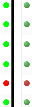
One of the students is colorblind and in looking at our continuous integration processes he mentioned that http://jenkins.plone.org is hard to see... Any chance @gforcada we could improve that?
The students were all asked to evaluate the CI for Plone vs OpenMRS, and almost all said they thought Plone's was better based on the good documentation, the nice display of test build results, the automated test runs. Thank you for the lovely work, CI team!
If you can narrow down what are the specific problems (I read that maybe the green/red balls could be) we have a specific CSS that we load on it that we have full control over:
 based on the good documentation, the nice display of test build results, the automated test runs. Thank you for the lovely work,