pigeonflight
April 7, 2021, 4:34pm
1
Any thoughts on why tab content is falling below the tabs when I use the vertical layout for Semantic UI Tabs?
According to Tab - Semantic UI React
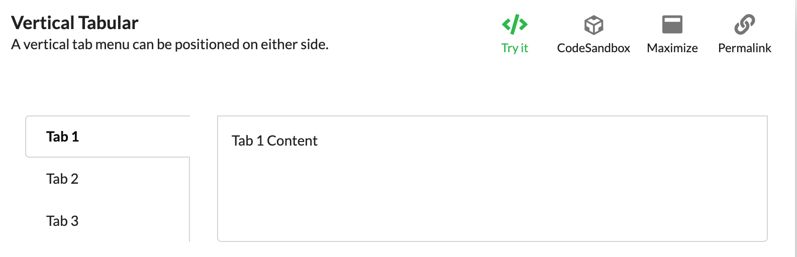
What I expect
A vertical tabular layout should look like this:
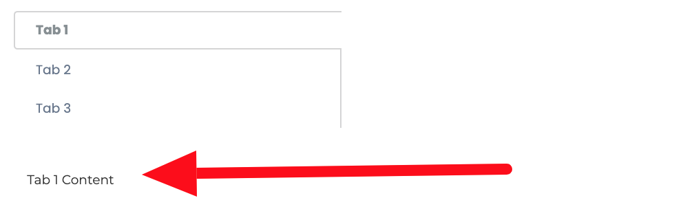
What I'm seeing
I've used the code in a custom block I'm working on and it ends up placing the tab content below the tabs instead of to the right of tabs.
the code
This is all the code for my View.jsx
/**
 * View VerticalTabMenu block.
 * @module components/Blocks/ResourceSearch/View
 */

import React from 'react';
import PropTypes from 'prop-types';
import { Tab } from 'semantic-ui-react';

const panes = [
  { menuItem: 'Tab 1', render: () => <Tab.Pane>Tab 1 Content</Tab.Pane> },
  { menuItem: 'Tab 2', render: () => <Tab.Pane>Tab 2 Content</Tab.Pane> },
  { menuItem: 'Tab 3', render: () => <Tab.Pane>Tab 3 Content</Tab.Pane> },
]


/**
 * View VerticalTabMenu block
 */
const View = ({ data, path }) => {
  return (

      <Tab menu={{ fluid: true, vertical: true, tabular: true }} panes={panes} />

      );
};

/**
 * Property types.
 * @property {Object} propTypes Property types.
 * @static
 */
View.propTypes = {
  data: PropTypes.objectOf(PropTypes.any).isRequired,
};

export default React.memo(View);
pigeonflight
April 7, 2021, 4:54pm
2
Based on what I know of pastanaga/volto we're working with a subset of the grid of 16 provided by semantic ui.
<div class="ui grid">
<div class="four wide column">
   <div class="ui vertical tabular menu">
   <a class="active item">Tab 1</a>
   <a class="item">Tab 2</a>
   <a class="item">Tab 3</a></div></div>
<div class="stretched twelve wide column">
  <div class="ui bottom attached segment active tab">Tab 1 Content</div>
</div>
</div>
So... I need to know how to override the default gird used for vertical tabs.
pigeonflight
April 7, 2021, 10:35pm
4
Thanks @tiberiuichim ,
I had to add a 'grid' property to my Tab. using a paneWidth of 8 or less works for me so far.
      <Tab menu={{ fluid: true, vertical: true, tabular: true }}
               panes={panes}
               grid={{ paneWidth: 8, tabWidth: 2, stackable: true }}
/>
pigeonflight
April 8, 2021, 3:48am
5
Further notes:
For example the list of available props of the Tab component can be found in the Tab.d.ts file:
import * as React from 'react'

import { SemanticShorthandItem } from '../../generic'
import TabPane, { TabPaneProps } from './TabPane'

export interface TabProps extends StrictTabProps {
  [key: string]: any
}

export interface StrictTabProps {
  /** An element type to render as (string or function). */
  as?: any

  /** The initial activeIndex. */
  defaultActiveIndex?: number | string

  /** Index of the currently active tab. */
  activeIndex?: number | string

  /** Shorthand props for the Menu. */
show original