Hi. Can anyone tell me how to get @kitconcept/volto-slider-block to slide automatically? Or is there another addon out there that does?
There's volto-block-image-cards that has a Carousel component. Notice that this addon uses non-standard fieldnames for image storage so you'd need backend integration as well.
eeacms/volto-listing-block has a Carousel, as well: volto-listing-block/src/blocks/Listing/layout-templates/Carousel.jsx at master · eea/volto-listing-block · GitHub and this addon is more modern, although I don't know how well it behaves in non-EEA Design System websites.
I think the easiest is to add that autoplay prop. Notice the autoplay prop that's passed to the Slick slider. You could customize (shadow) the View component from @kitconcept/volto-slider-block and add that prop.
I added the autoplay prop and it works! Thanks a lot @tiberiuichim
@tiberiuichim ... now that volto-slider-block uses embla and not slick carousel. This approach doesn't seem to work anymore.
According to the embla docs, I need to integrate an autoplay plugin (https://www.embla-carousel.com/plugins/autoplay/)
Here's what I've done so far.
Step 1 - install the plugin
In my volto project I installed the plugin
yarn add embla-carousel-autoplay
Step 2 - shadow the View.jsx from volto-slider-block and call embla's autoplay plugin
 @mikemets, did I do the shadowing correctly?
The key thing is that I import Autoplay and then use it (as documented).
There's a line in my shadowed code that calls the autoplay plugin:
const [emblaRef, emblaApi] = useEmblaCarousel({ loop: true },[Autoplay()]);
Not sure I'm doing that correctly... but this is my new code in my shadowed version of View.jsx:
import React, { useCallback, useEffect, useState } from 'react';
import { Message } from 'semantic-ui-react';
import useEmblaCarousel from 'embla-carousel-react';
import Autoplay from 'embla-carousel-autoplay';
import cx from 'classnames';
import { defineMessages, useIntl } from 'react-intl';
import Body from './Body';
import { withBlockExtensions } from '@plone/volto/helpers';
import { DotButton, NextButton, PrevButton } from './DotsAndArrows';
import teaserTemplate from '../icons/teaser-template.svg';

const messages = defineMessages({
  PleaseChooseContent: {
    id: 'Please choose an existing content as source for this element',
    defaultMessage:
      'Please choose an existing content as source for this element',
  },
});

const SliderView = (props) => {
  const {
    className,
    data,
    isEditMode = false,
    block,
    openObjectBrowser,
    onChangeBlock,
    slideIndex,
    setSlideIndex,
  } = props;
  const intl = useIntl();

  const [prevBtnDisabled, setPrevBtnDisabled] = useState(true);
  const [nextBtnDisabled, setNextBtnDisabled] = useState(true);
  const [selectedIndex, setSelectedIndex] = useState(0);
  const [scrollSnaps, setScrollSnaps] = useState([]);

  const [emblaRef, emblaApi] = useEmblaCarousel({ loop: true },[Autoplay()]);

  const scrollPrev = useCallback(() => {
    if (emblaApi) {
      emblaApi.scrollPrev();
      setSlideIndex && setSlideIndex(selectedIndex - 1);
    }
  }, [emblaApi, selectedIndex, setSlideIndex]);

  const scrollNext = useCallback(() => {
    if (emblaApi) {
      emblaApi.scrollNext();
      setSlideIndex && setSlideIndex(selectedIndex + 1);
    }
  }, [emblaApi, selectedIndex, setSlideIndex]);

  const scrollTo = useCallback(
    (index) => {
      if (emblaApi) {
        emblaApi.scrollTo(index);
        setSlideIndex && setSlideIndex(index);
      }
    },
    [emblaApi, setSlideIndex],
  );

  const onInit = useCallback((emblaApi) => {
    setScrollSnaps(emblaApi.scrollSnapList());
  }, []);

  const onSelect = useCallback((emblaApi) => {
    setSelectedIndex(emblaApi.selectedScrollSnap());
    setPrevBtnDisabled(!emblaApi.canScrollPrev());
    setNextBtnDisabled(!emblaApi.canScrollNext());
  }, []);

  useEffect(() => {
    if (!emblaApi) return;

    onInit(emblaApi);
    onSelect(emblaApi);
    emblaApi.on('reInit', onInit);
    emblaApi.on('reInit', onSelect);
    emblaApi.on('select', onSelect);
  }, [emblaApi, onInit, onSelect]);

  useEffect(() => {
    // This syncs the current slide with the objectwidget (or other sources
    // able to access the slider context)
    // that can modify the SliderContext (and come here via props slideIndex)
    if (isEditMode) {
      scrollTo(slideIndex);
    }
  }, [slideIndex, scrollTo, isEditMode]);

  const sliderContainerWidth = emblaApi
    ?.rootNode()
    .getBoundingClientRect().width;

  return (
    <>
      <div
        className={cx('block slider', className)}
        style={{ '--slider-container-width': `${sliderContainerWidth}px` }}
      >
        {(data.slides?.length === 0 || !data.slides) && isEditMode && (
          <Message>
            <div className="teaser-item default">
              <img src={teaserTemplate} alt="" />
              <p>{intl.formatMessage(messages.PleaseChooseContent)}</p>
            </div>
          </Message>
        )}
        {data.slides?.length > 0 && (
          <>
            <div className="slider-wrapper">
              {!data.hideArrows && data.slides?.length > 1 && (
                <>
                  <PrevButton onClick={scrollPrev} disabled={prevBtnDisabled} />
                  <NextButton onClick={scrollNext} disabled={nextBtnDisabled} />
                </>
              )}

              <div className="slider-viewport" ref={emblaRef}>
                <div className="slider-container">
                  {data.slides &&
                    data.slides.map((item, index) => {
                      return (
                        <div key={item['@id']} className="slider-slide">
                          <Body
                            {...props}
                            key={item['@id']}
                            data={item}
                            isEditMode={isEditMode}
                            dataBlock={data}
                            index={index}
                            block={block}
                            openObjectBrowser={openObjectBrowser}
                            onChangeBlock={onChangeBlock}
                            isActive={selectedIndex === index}
                          />
                        </div>
                      );
                    })}
                </div>
              </div>
            </div>
            {data.slides?.length > 1 && (
              <div className="slider-dots">
                {scrollSnaps.map((_, index) => (
                  <DotButton
                    key={index}
                    index={index}
                    onClick={() => scrollTo(index)}
                    className={'slider-dot'.concat(
                      index === selectedIndex ? ' slider-dot--selected' : '',
                    )}
                  />
                ))}
              </div>
            )}
          </>
        )}
      </div>
    </>
  );
};

export default withBlockExtensions(SliderView);
Unfortunately, my carousel is not yet autoplaying  so I'm doing something wrong still.
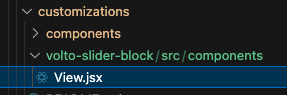
The shadow need also the namespace and no src:
@kitconcept/volto-slider-block/components/View.jsx
Thanks @sneridagh ... it's probably somewhere in the docs, but I wasn't finding it.
The shadowing path was indeed wrong.
I also had to change all the relative path imports:
For example:
import { DotButton, NextButton, PrevButton } from './DotsAndArrows';
became
import { DotButton, NextButton, PrevButton } from '@kitconcept/volto-slider-block/components/DotsAndArrows';
Here's the new View.jsx
import React, { useCallback, useEffect, useState } from 'react';
import { Message } from 'semantic-ui-react';
import useEmblaCarousel from 'embla-carousel-react';
import Autoplay from 'embla-carousel-autoplay';
import cx from 'classnames';
import { defineMessages, useIntl } from 'react-intl';
import Body from '@kitconcept/volto-slider-block/components/Body';
import { withBlockExtensions } from '@plone/volto/helpers';
import { DotButton, NextButton, PrevButton } from '@kitconcept/volto-slider-block/components/DotsAndArrows';
import teaserTemplate from '@kitconcept/volto-slider-block/icons/teaser-template.svg';

const messages = defineMessages({
  PleaseChooseContent: {
    id: 'Please choose an existing content as source for this element',
    defaultMessage:
      'Please choose an existing content as source for this element',
  },
});

const SliderView = (props) => {
  const {
    className,
    data,
    isEditMode = false,
    block,
    openObjectBrowser,
    onChangeBlock,
    slideIndex,
    setSlideIndex,
  } = props;
  const intl = useIntl();

  const [prevBtnDisabled, setPrevBtnDisabled] = useState(true);
  const [nextBtnDisabled, setNextBtnDisabled] = useState(true);
  const [selectedIndex, setSelectedIndex] = useState(0);
  const [scrollSnaps, setScrollSnaps] = useState([]);

  const [emblaRef, emblaApi] = useEmblaCarousel({ loop: true },[Autoplay()]);

  const scrollPrev = useCallback(() => {
    if (emblaApi) {
      emblaApi.scrollPrev();
      setSlideIndex && setSlideIndex(selectedIndex - 1);
    }
  }, [emblaApi, selectedIndex, setSlideIndex]);

  const scrollNext = useCallback(() => {
    if (emblaApi) {
      emblaApi.scrollNext();
      setSlideIndex && setSlideIndex(selectedIndex + 1);
    }
  }, [emblaApi, selectedIndex, setSlideIndex]);

  const scrollTo = useCallback(
    (index) => {
      if (emblaApi) {
        emblaApi.scrollTo(index);
        setSlideIndex && setSlideIndex(index);
      }
    },
    [emblaApi, setSlideIndex],
  );

  const onInit = useCallback((emblaApi) => {
    setScrollSnaps(emblaApi.scrollSnapList());
  }, []);

  const onSelect = useCallback((emblaApi) => {
    setSelectedIndex(emblaApi.selectedScrollSnap());
    setPrevBtnDisabled(!emblaApi.canScrollPrev());
    setNextBtnDisabled(!emblaApi.canScrollNext());
  }, []);

  useEffect(() => {
    if (!emblaApi) return;

    onInit(emblaApi);
    onSelect(emblaApi);
    emblaApi.on('reInit', onInit);
    emblaApi.on('reInit', onSelect);
    emblaApi.on('select', onSelect);
  }, [emblaApi, onInit, onSelect]);

  useEffect(() => {
    // This syncs the current slide with the objectwidget (or other sources
    // able to access the slider context)
    // that can modify the SliderContext (and come here via props slideIndex)
    if (isEditMode) {
      scrollTo(slideIndex);
    }
  }, [slideIndex, scrollTo, isEditMode]);

  const sliderContainerWidth = emblaApi
    ?.rootNode()
    .getBoundingClientRect().width;

  return (
    <>
      <div
        className={cx('block slider', className)}
        style={{ '--slider-container-width': `${sliderContainerWidth}px` }}
      >
        {(data.slides?.length === 0 || !data.slides) && isEditMode && (
          <Message>
            <div className="teaser-item default">
              <img src={teaserTemplate} alt="" />
              <p>{intl.formatMessage(messages.PleaseChooseContent)}</p>
            </div>
          </Message>
        )}
        {data.slides?.length > 0 && (
          <>
            <div className="slider-wrapper">
              {!data.hideArrows && data.slides?.length > 1 && (
                <>
                  <PrevButton onClick={scrollPrev} disabled={prevBtnDisabled} />
                  <NextButton onClick={scrollNext} disabled={nextBtnDisabled} />
                </>
              )}

              <div className="slider-viewport" ref={emblaRef}>
                <div className="slider-container">
                  {data.slides &&
                    data.slides.map((item, index) => {
                      return (
                        <div key={item['@id']} className="slider-slide">
                          <Body
                            {...props}
                            key={item['@id']}
                            data={item}
                            isEditMode={isEditMode}
                            dataBlock={data}
                            index={index}
                            block={block}
                            openObjectBrowser={openObjectBrowser}
                            onChangeBlock={onChangeBlock}
                            isActive={selectedIndex === index}
                          />
                        </div>
                      );
                    })}
                </div>
              </div>
            </div>
            {data.slides?.length > 1 && (
              <div className="slider-dots">
                {scrollSnaps.map((_, index) => (
                  <DotButton
                    key={index}
                    index={index}
                    onClick={() => scrollTo(index)}
                    className={'slider-dot'.concat(
                      index === selectedIndex ? ' slider-dot--selected' : '',
                    )}
                  />
                ))}
              </div>
            )}
          </>
        )}
      </div>
    </>
  );
};

export default withBlockExtensions(SliderView);
With those adjustments, my autoplay slider now works 
1 Like
It might be good to extend volto-slider-block to make it possible to manage some of the embla carousel features through the web.