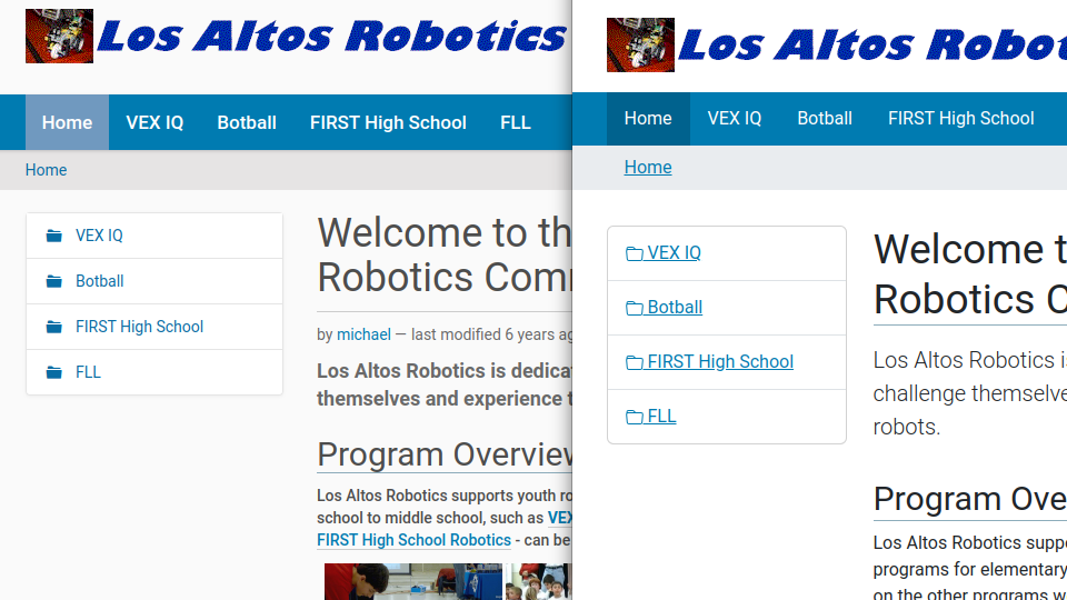
I migrated from Plone 5.2.5 to Plone 6.0.8 by copying filestorage and blobstorage to /data in Docker volume, starting a Plone Docker nginx-plone container, and upgrading using the localhost:8080 interface. My site is simple and I want to stick with the Classic UI for now. In the image below, the Plone 5.2.5 instance is on the left and the new 6.0.8 instance is on the right. I have noticed several differences between them including:
- Folder Icons in the left frame are filled in 5.2.5 and not filled in 6.0.8
- The folder icons and name are underlined in the left frame in 5.2.5 and not in 6.0.8
- The vertical line spacing is tighter in 5.2.5 than in 6.0.8
- The body fonts are slightly different
Is there a way to make the 6.0.8 instance look more like the 5.2.5 instance?
Thanks,
Michael